
Design system · v2
The system.
Every size on dozfx.com comes from a small set of tokens, and every effect follows a small set of rules. Nothing is placed by eye. On a computer, press G on any page to lay the grid over it.
Grid
12 · 8 · 4.
12 columns on desktop, 8 on tablet, 4 on phones. Gutter 16 → 24 px, outer margin 24 → 64 px, content width 1,312 px at most. Running text stops at about 70 characters.
- Breakpoints
- 768 · 1024 px
- Baseline
- 4 px (line heights) · 8 px (spacing)
- Sections
- 88 → 152 px apart
- Radii
- 22 px cards · 28 px feature panels · pill buttons
- Aspect ratios
- 16:9 · 4:5 · 1:1 · 3:2
- Phones
- One column, buttons start at the text edge, full-screen images framed
Type
One scale.
Every size is a step on one √φ scale (ratio 1.272) from a 17 px base. PolySans Bulky for headlines, set heavy and tight; Space Grotesk for all text, down to 10 px for labels. Headlines build up word by word. Over a full-screen image the headline is set as big as its longest line allows.
Spacing
8-point.
Ten tokens replace the 34 spacing values measured on the old home page.
Colour
Black, white, #FF00FF.
- Ground
- #000000
- Type
- #FFFFFF · 21:1
- Accent
- #FF00FF, exact, everywhere
- Shades
- Only #FF00FF mixed with white or black, so the hue never drifts
- Images
- Dark grounds and magenta light; other colour only where the story needs it
- 3D
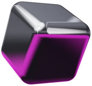
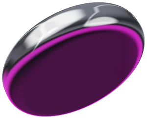
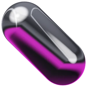
- Chrome and magenta, lit like a studio: a softbox top left, a strip light right, a magenta bounce from below
- Legal pages
- White ground, black type, the same accent
- Contrast
- Body text at least 4.5:1 on its ground
Motion
Liquid, not loud.
Smooth scrolling, one easing family, transform and opacity wherever possible. Effects run only while they are on screen. Reduced-motion settings turn every effect into a short fade.
- Logo
- The striped D, animated in SVG and CSS
- Home hero
- A chrome form that melts from one service shape into the next, with a short magenta neon flicker; on phones too
- Starfield
- One per page with its own flight path: radial, horizontal, diagonal, rising or vortex. It jumps to warp when you change page
- Full-screen images
- Assemble from stripes; the headline rises, holds, then fades before the next section slides over
- Sticky and parallax
- Pinned headings and images, page titles that lift away, stacking cards
- Marquee
- Drifts with the scroll; grab it and throw it
- Buttons
- Fill from the entry point, magnetic pull ≤ 6 px; on touch screens only while pressed
- Page change
- 140 ms of warp, then the next page, usually prepared while you pointed at the link
Signature visuals
Shapes, in code.
One shape for each service. They are not images: each is ray-marched live in the browser, a few kilobytes of code instead of video. On a computer, drag one to spin it. The home hero melts through them in turn.
01 Brand and identity
02 Websites and digital products
03 Campaigns and content
04 AI visibility
05 Creative retainer

- Home hero
- The five shapes as one chrome liquid, rendered live
- Planet
- The endless striped path from the old about page, rebuilt in WebGL2 and set at dusk
- Archive
- A spiral tunnel of images flying toward you
- Warp
- Three words fly out of the vanishing point and past you
- Packages
- Each package as a 3D bag, printed and lit in real time
- Reel
- Full screen from the first second, streamed small first and sharper as the line allows
Speed
Budget.
- Per page
- 10 to 22 KB of HTML (compressed). One stylesheet (48 KB) and one script (48 KB) serve the whole site and are cached after the first visit.
- Fonts
- Two files, 40 KB together, preloaded.
- Images and films
- Load as you come close and stop downloading the moment you leave the page, so the next page gets the whole line.
- Next page
- Chrome prepares the page a link points at while you hover it; other browsers fetch it ahead. The click shows it at once.
- Reel
- Adaptive streaming: it starts small within a second and sharpens as the line allows; hls.js (90 KB) loads only on the reel page.
- Lighthouse mobile (lab)
- 95–99 · LCP 2.0–2.5 s · CLS 0 · TBT 30–180 ms
- Lighthouse desktop (lab)
- 99–100 · LCP 0.5–0.6 s · CLS 0 · TBT 0 ms
- Note
- Lab values for the home and services pages, measured in the build environment in October 2026.